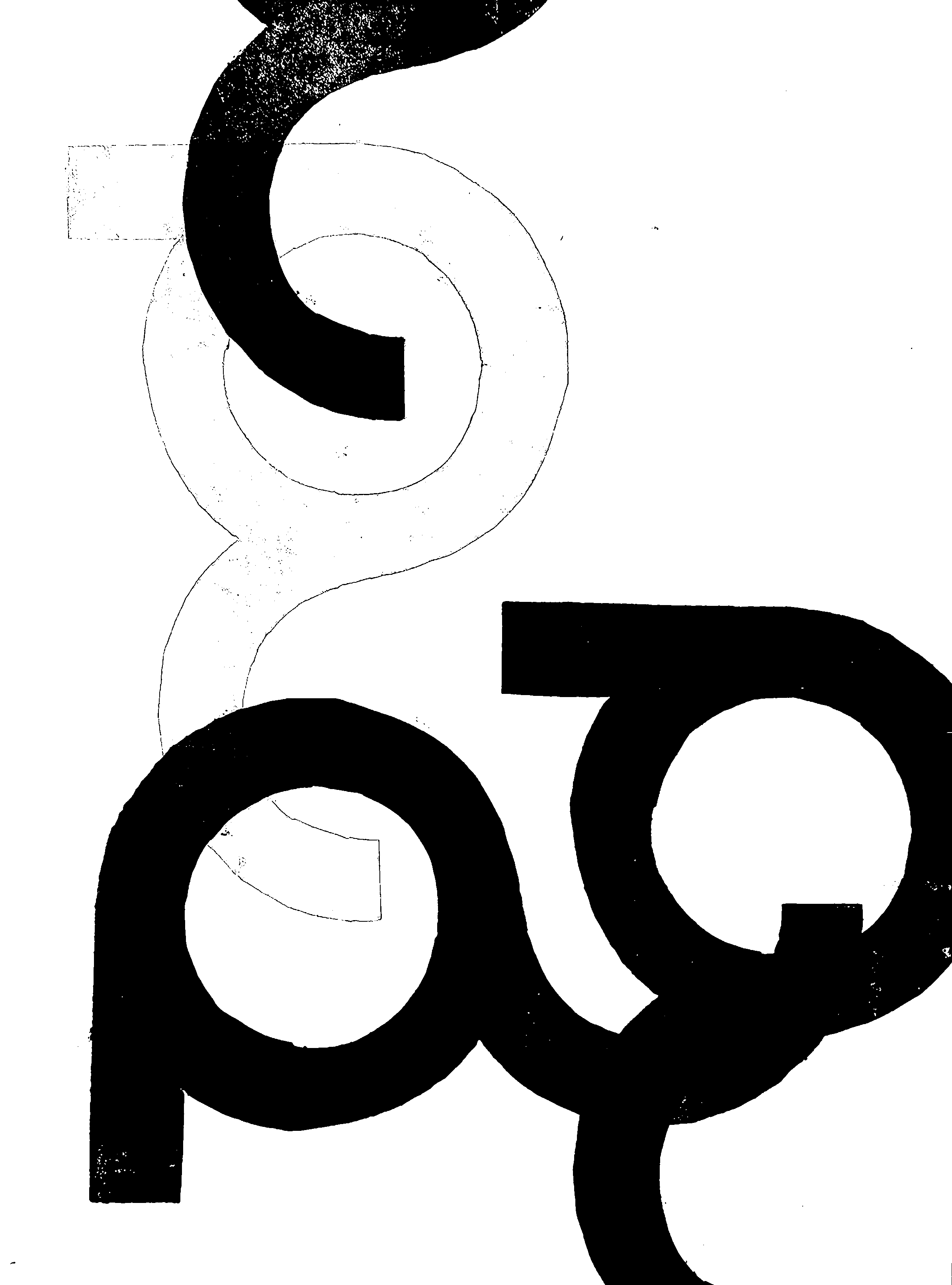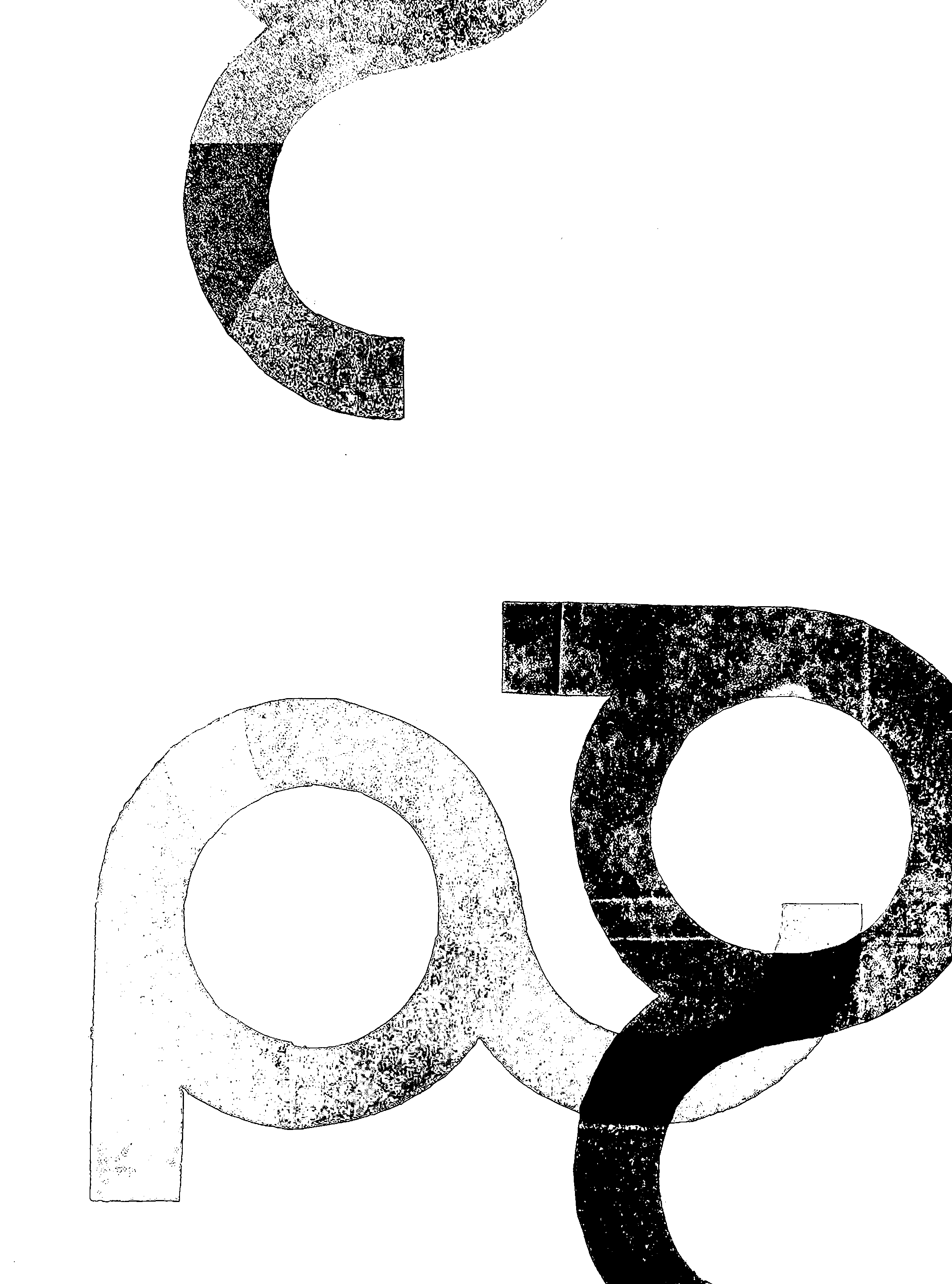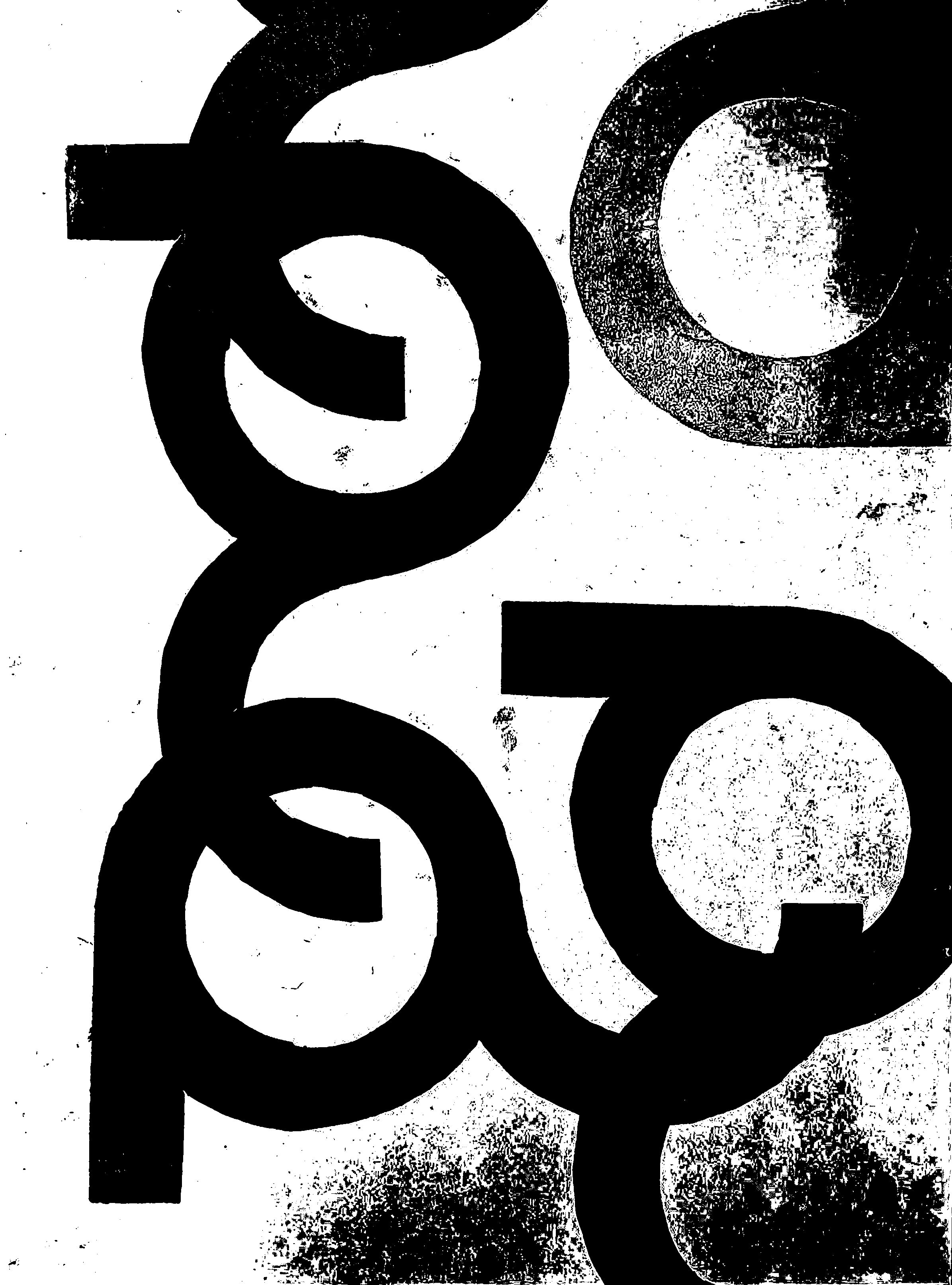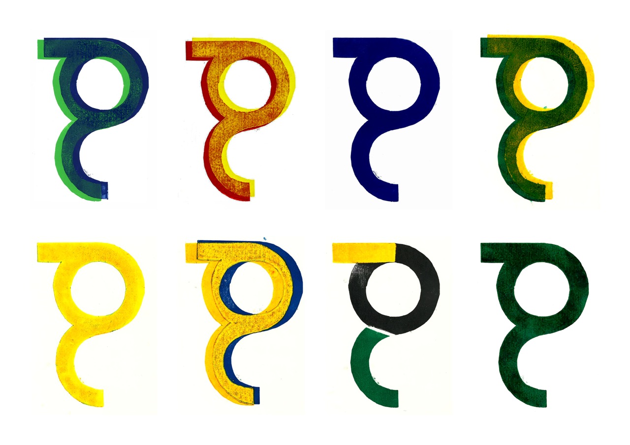
For my introductory assignment in the first year, I studied the letter g in a conceptual manner. I explored the boundaries of typography by working with a single linocut. By the varying opacity of the inks, I obtained different transparencies, which ultimately resulted in a poster in which I combined the five colours. This series was later converted into an animation and functioned as a header on my website.